Click here to see it in action.
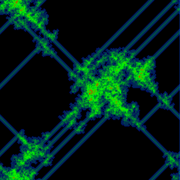
This is an update to the previous Langton’s Ant experiment. For this one I have added a heat map which shows the frequency with which the “ant” visits each cell in this grid. The more visits to a cell, the “hotter” the color. Click the application to toggle between the ant view and the heat map view.
I am really enjoying playing around with this thing. I have “hex” and “oct” variations (the above is a “quad”) waiting in the wings, and am exploring what it will take to make a 3d version, which hopefully I will have done this weekend.
